Beef up your Illustrator skills while creating an ominous jar of purple ooze. In this tut you will find handy tips and techniques for illustrating glass, chrome and toxic ooze.

Note: your glass jar should have a white fill in order for your Inner Glow to show up. You will also need to set the glass shape to multiply (in the Transparency Palette) so that when you add a colored background behind that jar, the white shape will look clear.
Note: Anything that’s filled with white becomes transparent when the shape is set to Multiply in the Transparency Palette. So, in the example below, the right-most color is actually white but becomes transparent because the overall shape is set to Multiply. You can use either technique (either using white or adjusting the swatch to transparent) to achieve the result, the choice is yours.
That’s it! You’ve just learned how to create a sweet jar of purple ooze. The fun doesn’t stop here, once you’ve made the perfect ooze jar you can get creative and design a label for your concoction. Enjoy!
Step 1
Start by using the Ellipse Tool (L) to draw an oval.Step 2
Fill the oval with a nice looking linear gradient using the Gradient Tool (G.)Step 3
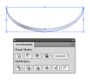
We’ll make a lip around the edge of the top by stacking two ovals on top of each other. In the Pathfinder pane click Minus Front. Make sure you have the original oval off to the side as we’ll need to use it laterStep 4
This is what your result will be.
Step 5
Make another two copies of the original oval and again use the Pathfinder’s Minus Front option to create another larger crescent shape.Step 6
Using the Rectangle Tool (M) draw a series of rectangles. Distribute them so that they are equally spaced.Step 7
Place the rectangles over the crescent shape that you just created and click Divide in the Pathfinder.Step 8
Ungroup and delete the extra shapes around the edge that you don’t need. Fill each square shape with a subtle linear gradient.Step 9
Using the original oval, copy and paste another instance of it and adjust the gradient so that it is perfectly vertical. We’ll use this new oval as the background for the entire cap.Step 10
Place the series of squares over the last oval (with the completely vertical gradient) and adjust the squares’ transparency to about 30%. Now you can use the original oval as well as the crescent shape and place all your elements on top of each other to form the whole cap.Step 11
Give the top edge of the cap a highlight by using a condensed crescent shape, fill the crescent with a linear white to transparent gradient.Step 12
Starting with two ovals and a rectangle, create the glass part of the jar. Select the three shapes and in the Pathfinder click Unite.Step 13
Once your shapes are united into one, select it and go to Object > Path > Offset Path. Enter -5px and click OK.Step 14
Using the Pencil Tool (N) draw an arbitrary shape that represents the top surface of the liquid.Step 15
Select the inner smaller shape and the liquid shape, in the Pathfinder click Divide. Ungroup and delete all the shapes besides the liquid surface and the area below that.Step 16
Select the outermost glass jar shape and go to Effect > Stylize > Inner Glow. Select Multiply for the Mode, select an Opacity of about 25% and give it a blur of about 15%.Note: your glass jar should have a white fill in order for your Inner Glow to show up. You will also need to set the glass shape to multiply (in the Transparency Palette) so that when you add a colored background behind that jar, the white shape will look clear.
Step 17
Looking closely you’ll notice that the jar has a slight highlight on the upper left glass area. Start with the main glass shape and subtract the oval shape from it to obtain the shape selected below. Give the shape a radial gradient that goes from white to transparent at the edges.Step 18
Draw a rectangle and apply an inner glow. Set this shape to Multiply so it blends with the background that we’ll add later.Step 19
Position the rectangle in the middle of the jar and make the left and right sides flush with the inner shape of the jar (see guides.) Move it to the back of all the other objects by going to Object > Arrange > Send to Back.Step 20
Fill the bottom liquid area with a linear purple gradient. Ensure that your jar has darker colors on the right since the light source is coming from the left.Step 21
Give the surface of the liquid a radial gradient. To enhance the appearance, condense the gradient so that it forms more of an oval. Mimic the shape of the cap’s oval with your gradient. Move the highlighted area to condense the gradient.Step 22
Small details go a long way. Having said that, use two shapes identical to the liquid surface to create a thin edge that will act as a highlight for the edge of the liquid surface. Select both shapes and in the Pathfinder click Minus Front.Step 23
Position the highlight over the edge of the liquid and give it a white to transparent linear gradient.Step 24
Add some strategically placed shadows (like under that cap) to enhance the realism. To add individual shadows draw a loose oval shape using the Pencil Tool and fill it with a purple gradient. Set the shape to Multiply in the Transparency Palette.Step 25
Go to Effect > Stylize > Gaussian Blur and enter a value of about 25.Step 26
Create ominous floating chunks inside the liquid with the Pencil Tool. Fill it with a linear gradient that goes to complete transparency.Step 27
Using the Pen Tool (P) draw the shape shown below.Step 28
Give the shape a radial gradient the goes from white to transparent. Make the center of the gradient substantially farther away from the shape so the reflection looks subtle.Step 29
Create the reflection on the top of the cap by drawing an arbitrary shape using the Pen Tool. Pay attention when drawing the shape so that it’s smooth with no abrupt angle changes.Step 30
Layer the reflection on top of the oval and click Divide in the Pathfinder. Delete all the other shapes besides the center grey area.Step 31
Place the grey shape over the top of the cap and give it a linear white to transparent gradient. Feel free to add more reflections where desired.Step 32
I’ve decided to darken up the right side of the jar even more. To do this simply draw a a tall rectangle shape and give it a linear gradient that goes from purple to transparent. Give it a gaussian blur and set the mode to Multiply in the Transparency Palette.Step 33
Create the background by drawing a rectangle and filling it with a yellow to green radial gradient.Step 34
Give the rectangle rounded corners by going to Effect > Stylize > Rounded Corners.Step 35
Draw an oval to create the main shadow for the jar, give it a drop shadow by going to Effect > Stylize > Drop Shadow. In the Drop Shadow dialog select Multiply and set the X and Y Offset to a low amount. Apply a blur of about 8% and select a purple color.Step 36
Position the shape behind the other objects.Step 37
To create an even more believable illustration, we’ll add another shadow. Using the Pencil Tool draw a shape similar to the one below. Give it a radial gradient that goes from transparent to purple and to transparent again.Note: Anything that’s filled with white becomes transparent when the shape is set to Multiply in the Transparency Palette. So, in the example below, the right-most color is actually white but becomes transparent because the overall shape is set to Multiply. You can use either technique (either using white or adjusting the swatch to transparent) to achieve the result, the choice is yours.
Step 38
Give the shadow a gaussian blur to complete the illustration.That’s it! You’ve just learned how to create a sweet jar of purple ooze. The fun doesn’t stop here, once you’ve made the perfect ooze jar you can get creative and design a label for your concoction. Enjoy!


